Skip to content

Alzado, architecture studio · Architecture

The website of an architecture studio that is about to open

Alzado is an architecture studio that is just getting started. A new studio has no years of history to tell, but it does have its first projects, its way of working and the people it works for. I built the website for exactly that: to let the photos speak, to give each project its own page and to make asking for a first meeting just one click away. The studio liked the proposal and the website will go live on its own domain when it opens.

  • Web design
  • Art direction
  • Logo
  • Motion and transitions
  • A page for each project
  • Google reviews
  • Technical SEO
In preparation: it will go live when the studio opens
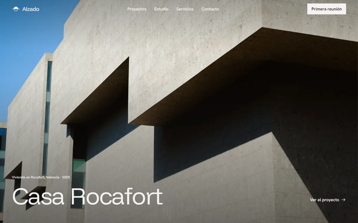
Home page of the Alzado website: a fair-faced concrete house filling the screen, with the project name, Casa Rocafort, at the bottom left
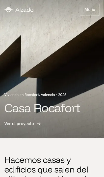
The same home page on a mobile phone, with the logo and the menu button over the photo

The approach

What it set out to avoid

What the sector’s websites repeat most

  • A loading screen or a carousel you have to wait for before you see anything.
  • Projects in a grid of identical photos, with no year, no location and no page of their own.
  • Generic icons and phrases that could belong to any company.
  • Google reviews added with an external widget that weighs more than the page itself.

The goal

That a studio with no years of history conveys craft from the very first screen, with its first projects in the leading role, and that the website loads fast on a mobile phone.

What was done

Piece by piece, nothing left half-done

Art direction

  • A “lime and cyanotype” palette: a light, almost neutral canvas, ink and a single blueprint blue.
  • Headings in Funnel Display at a light weight and body text in Hanken Grotesk, both hosted on the site’s own domain.
  • A logo based on the elevation mark used on architectural drawings: a circle split by the ground line.
  • No cards, no shadows and no rounded corners: the hierarchy comes from size, white space and fine rules.
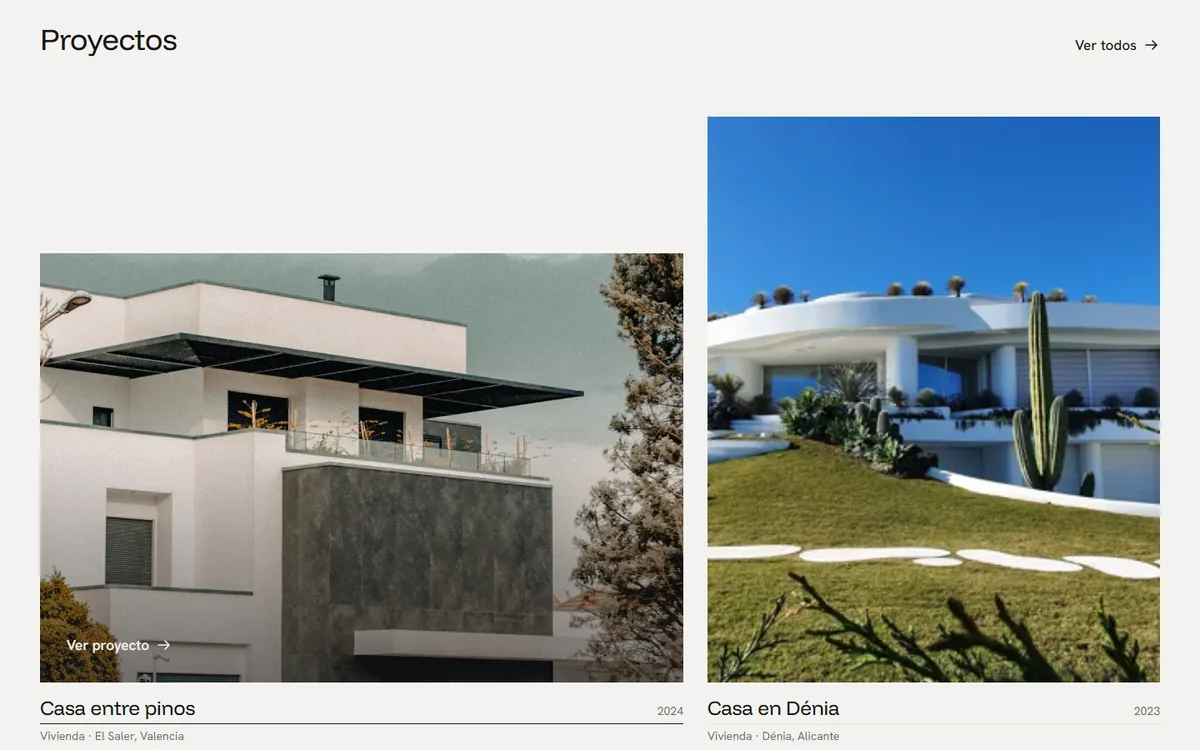
Projects

  • An asymmetric grid: each photo keeps its own proportions, never four identical ones in a row.
  • A page for each project with a technical sheet (type, location, year, floor area and status), text and a gallery.
  • A filter by project type that does not reload the page.
  • On hover, the photo moves closer, a veil falls over it and “View project” appears.

Motion

  • The name of the featured project rises word by word when the page loads.
  • Photos are revealed from their own side as they appear and settle with a gentle zoom.
  • When you open a project, its photo travels from the grid to the header of its page.
  • The header hides when you scroll down and comes back when you scroll up. With “reduce motion” turned on, there are only fades.

Trust

  • Google-style reviews, built by hand: average rating, stars and cards, with no external widget.
  • Frequently asked questions from people commissioning a house: fees, timeframes and planning permission.
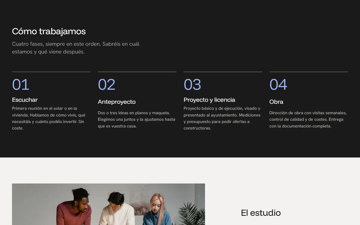
  • The process in four phases, so that clients know which one they are in.

Contact

  • A single call to action across the whole website: “Request a first meeting”.
  • A form that flags each error as it happens and asks before you leave if it is only half filled in.

Technical

  • Static HTML and a few dozen lines of JavaScript: no animation library.
  • Photos in WebP at three sizes, with their space reserved: the page does not jump while it loads.
  • Structured data for the studio, a sitemap and legal pages.

In motion

Half a minute of browsing

This is how the home page looks when you arrive and scroll down: the project name rises word by word, the photos are revealed from their own side and, when you open a project, its photo travels to the header of the page.

All the motion respects the system’s reduce motion setting: anyone who has it turned on sees fades, not movement.

Recording of the website in a desktop browser, at real speed.

On mobile

Designed for the thumb

On a mobile phone, the menu opens full screen, the photos keep their proportions and the strip of reviews can be swiped with a finger.

Buttons of at least 44 pixels, text that never runs off the screen and nothing you have to pinch to read.

Recording of the website on an emulated mobile phone, at real speed.

Trust

Reviews just like on Google

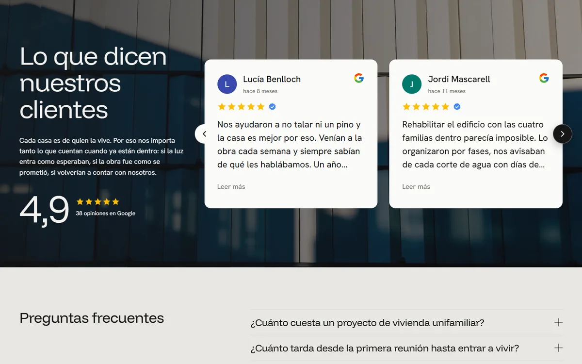
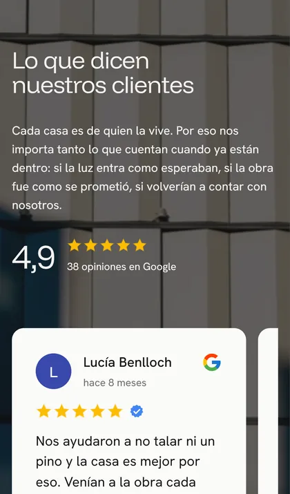
A studio that is starting out lives on what its first clients say. The reviews look the way they do on Google, with an average rating, stars and “X months ago”, but without loading any external widget: the page is no heavier and it tracks nobody.

Client reviews on a mobile phone: a card with stars, the Google logo and arrows to move between them
The reviews on a mobile phone: swipe with your finger or use the arrows.

In numbers

What is behind it

Facts about the work, not business results: those are published when there is real data.

15
pages, one for each project
100
in accessibility, best practices and SEO (Lighthouse, measured locally)
44
automated tests on desktop and mobile, all passing
0
animation libraries: the motion is CSS

More screens

How it looks

Project grid with photos of different proportions and the text View project over the photo under the pointer
Project grid: each photo keeps its own proportions. On hover, a veil falls over the photo and “View project” appears.
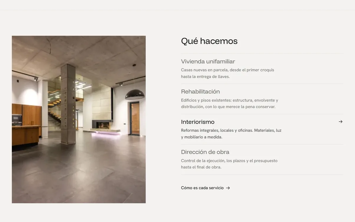
What we do section, with a photo on the left and the list of services on the right
“What we do”: the photo on the left changes depending on the service you point at.
Dark band with the four numbered phases of the work
The process in four phases, in the only dark band on the page.
Client reviews over an architecture photo, with the average rating on the left and review cards on the right
Reviews over a full-bleed photo: average rating on the left and Google-style cards on the right.
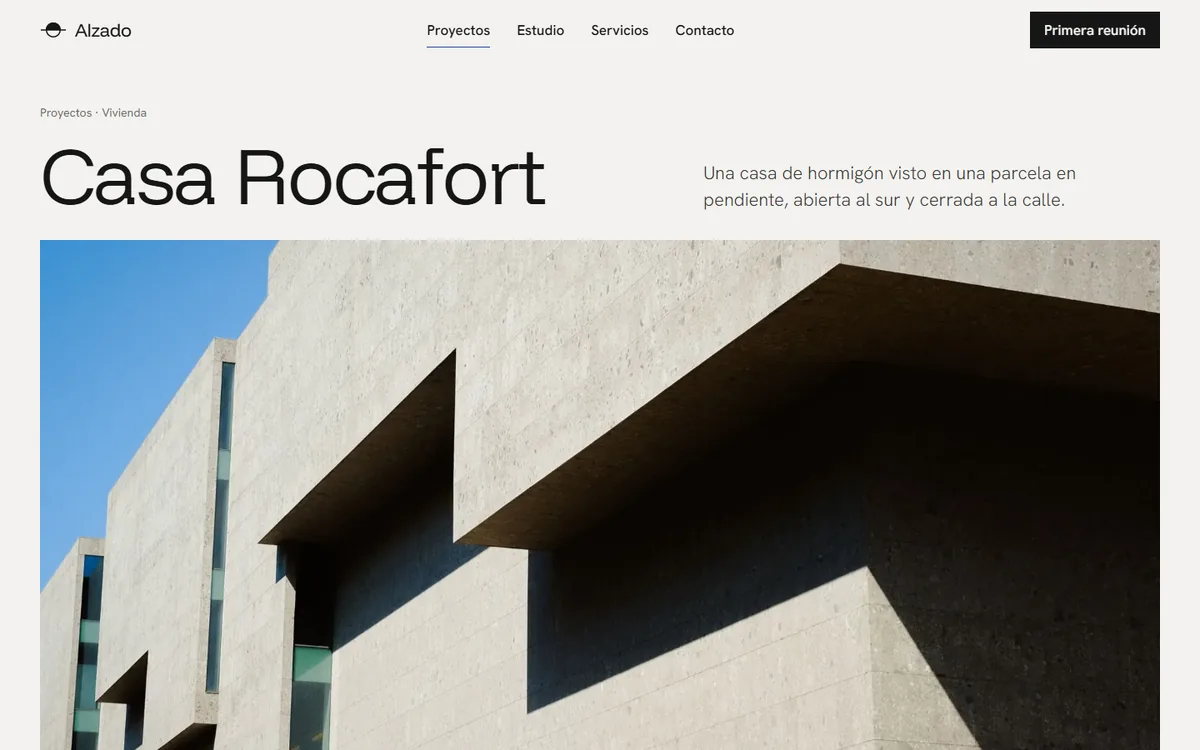
Header of a project page with its name in large type and the cover photo
Each project has its own page: name, introduction, technical details and gallery.
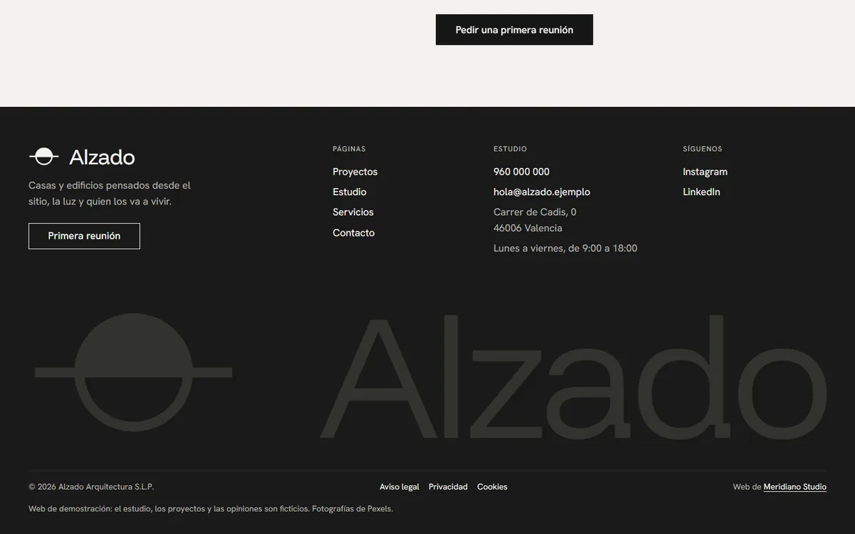
Dark website footer with the logo spanning the full width
The footer, with the full-width logo as a signature.

How it was done

From day one to running

  1. First

    References and direction

    Websites of architecture and interior design studios as a starting point: what works and what is unnecessary. That is where the palette, the typefaces and the rules came from.

  2. Then

    Structure

    A twelve-column grid, a fixed spacing scale and a page for everything that someone commissioning a building project looks for.

  3. Next

    Identity and motion

    Logo, Google-style reviews and the motion: words that rise, photos that are revealed and transitions between pages.

  4. Finally

    Audit and testing

    Lighthouse and automated tests of every flow: menu, project filter, form, reviews and transitions.

Where it is now

The status, no make-up

In preparation: it will go live when the studio opens

The website is ready and the studio liked it. It will go live on its own domain when the studio opens, with its own logo, projects, photos and details. It is too early to talk about results and I will not make any up. If you have an architecture or interior design studio, I will show you the whole thing at our first meeting.

Another project

You may also like

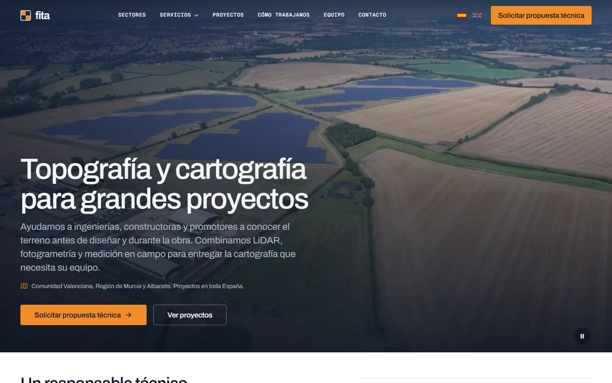
Home page of the fita website on a computer: aerial video of fields and a solar plant in the background, the headline “Surveying and mapping for large projects” (in Spanish) and the Request a technical proposal button

fita · Drone mapping · Drone surveying and mapping

Website, SEO and a blog for a drone mapping company

A website with a video on the home page, a page for each service and each map product, an English version and a blog with new articles published regularly. With the search positioning done from day one.

  • Web design
  • SEO and search positioning
  • Blog
  • English version
Live since 16 October 2026 Read the case
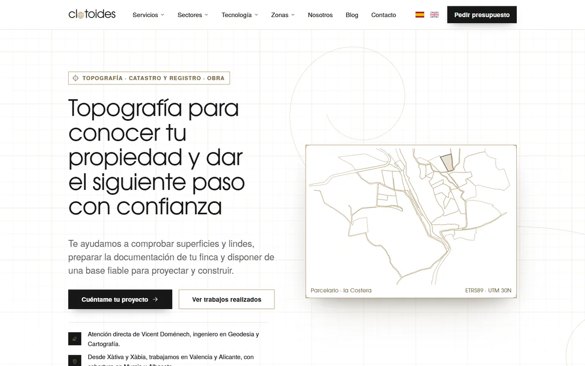
Home page of the Clotoides website on a computer: the headline “Surveying to know your property and take the next step with confidence” (in Spanish) next to a map of the La Costera land parcels in golden lines

Clotoides · Surveying · Surveying, Cadastre and Land Registry

A new website and SEO for a surveying company that already showed up on Google

A new website that keeps the 119 addresses of the old one so the search positioning is not lost, with a real cadastral map for each area, an English version and a 74-article blog that keeps growing.

  • Web design
  • SEO and search positioning
  • Blog
  • Migration without losing SEO
Live since 17 October 2026 Read the case
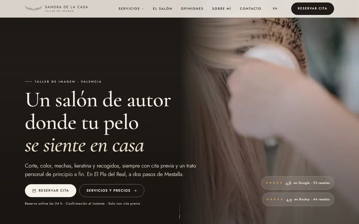
Home page of the Sandra de la Casa website on a computer: headline, book-an-appointment button and Google and Booksy ratings

Sandra de la Casa · Taller de Imagen · Signature hair salon · Valencia

Website, local SEO and Google Business Profile for a signature hair salon

She had 137 reviews and no website. In one week: a page for each service with its price, booking through Booksy, a complete Google profile and an English version.

  • Web design
  • Local SEO
  • Google Business Profile
  • QR code for reviews
Live since 30 September 2026 Read the case
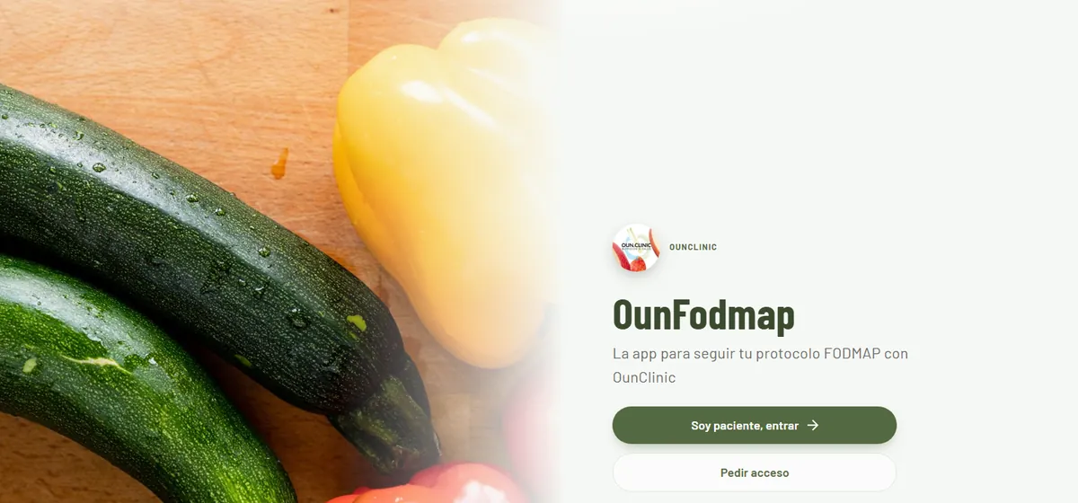
Home screen of the OunFodmap app with the OunClinic logo and the sign-in and request-access buttons

OunClinic · Nutrition clinic

An app to follow the FODMAP diet, with a dashboard for the nutritionist

Installable app for patients and a real-time dashboard for the nutritionist: 222 foods, automatic reintroduction, reports in two languages and protected health data.

  • Custom app
  • Real-time dashboard
  • Applied AI
  • Health data
In use at the clinic Read the case

All case studies

Start here

Something similar for your business?
Tell me about it in half an hour.

Free and with no commitment. We leave with what would make sense to do first and, if it fits, a proposal with a fixed price.